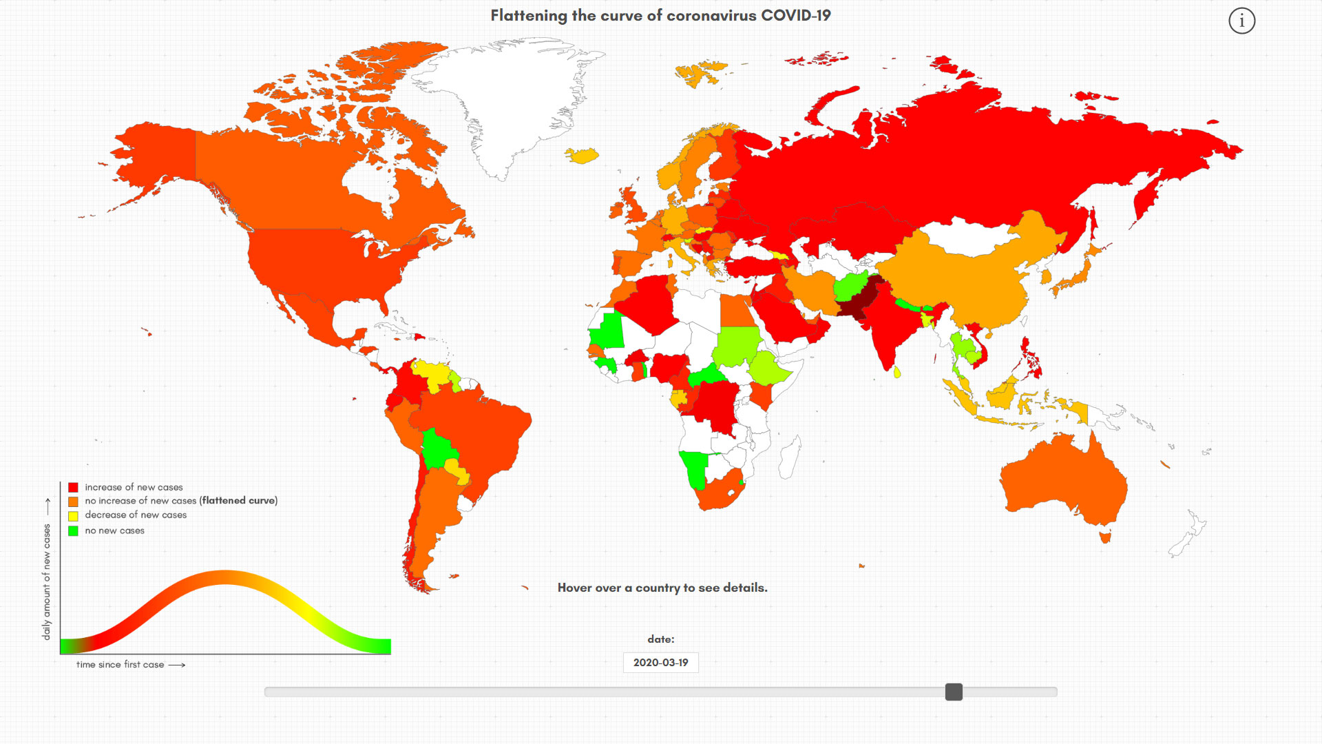
To start with, we decided to use a map we used in an earlier project depicting the growth of the world population. This map was already connected to a database with country names and all we had to make it work for this project was to connect it to the Corona numbers released daily. That being done, the difficult part commenced. We converted the number of corona cases per day to a growth factor we averaged over five days. After that we connected the possible growth factors to a color coding corresponding to the now well known curve.